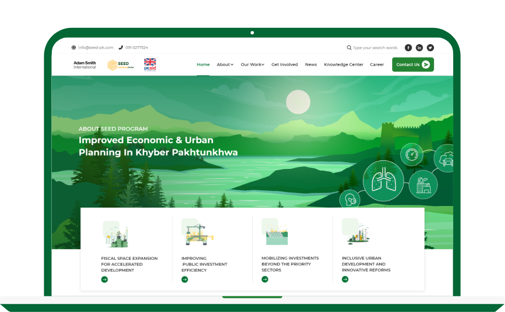
A Website for Khyber Pakhtunkhwa for improving economic development
ABOUT
SEED is a six-year, UK-funded £37.5 million programme. Its first component (£15 million) aims at improving economic and urban planning in Khyber Pakhtunkhwa (KP) to help the province plan and finance investments it needs for growth, jobs, and prosperity.
SEED is providing technical assistance to the Government of KP (GoKP) by introducing appropriate policy responses based on evidence and international best practices that would stabilise the GoKP’s fiscal position, shield investment and jobs, and pave the way for a quicker economic recovery.
The client came to us looking for a redesign and revamp of existing website. The current website was created at the inception of SEED and didn’t reflect all the work they have been doing since then.

SEED works in many verticals and due to diversification and volume of their initiative. It was important to design UX with data divided into smaller logical bits, resulting in simplified and seamless user flow. For bifurcation of data we scheduled multiple stakeholder meetings and divided all interventions into four main components. Each component was given a vector shape and color to be easily distinguishable. Alongside sitemap and wireframes were created before deep diving into UI of the website.
Goal of the project was to create a redesigned, user experience that will improve the customer journey of both donors and beneficiaries of SEED.
HOW DO WE WORK

THE TEAM
Project Manager/Lead
UIUX Designer

UIUX Designer

Web Developer
THE STEPS

We had to put our minds together and figure solutions for website. After having multiple meetings we discovered the project needed much more than initial design. The design team held deep research to discover more about client, the project, and their actual needs.

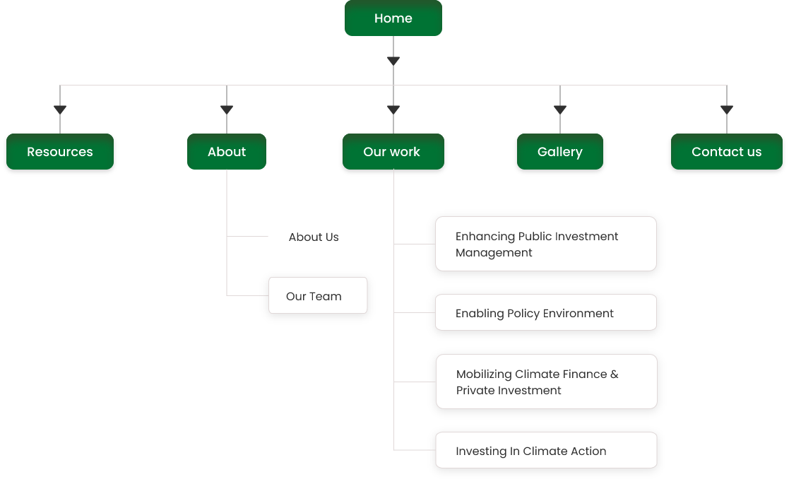
The meetings allowed us to design the sitemap and create the better structure. Our team figure out the better way to organize the current website and make it more visually appealing.
After doing the initial meetings and research for finding out the best structure for the website, Centangle finally design a visual idea and create wireframes.
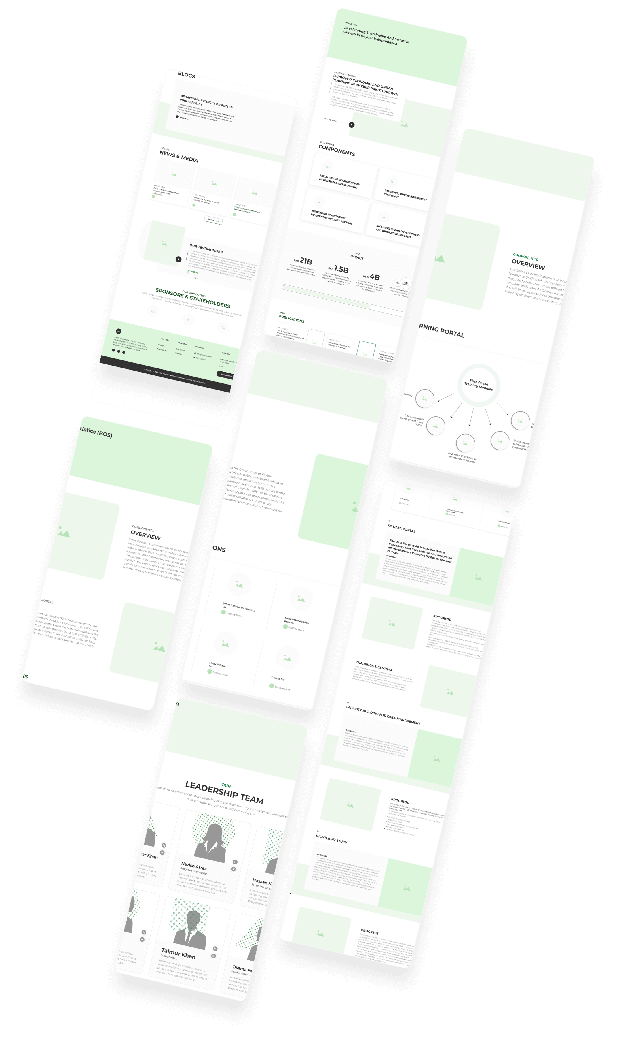
So we put all our efforts, imaginations, concepts, preparation and research into real designs and create a better UI for product
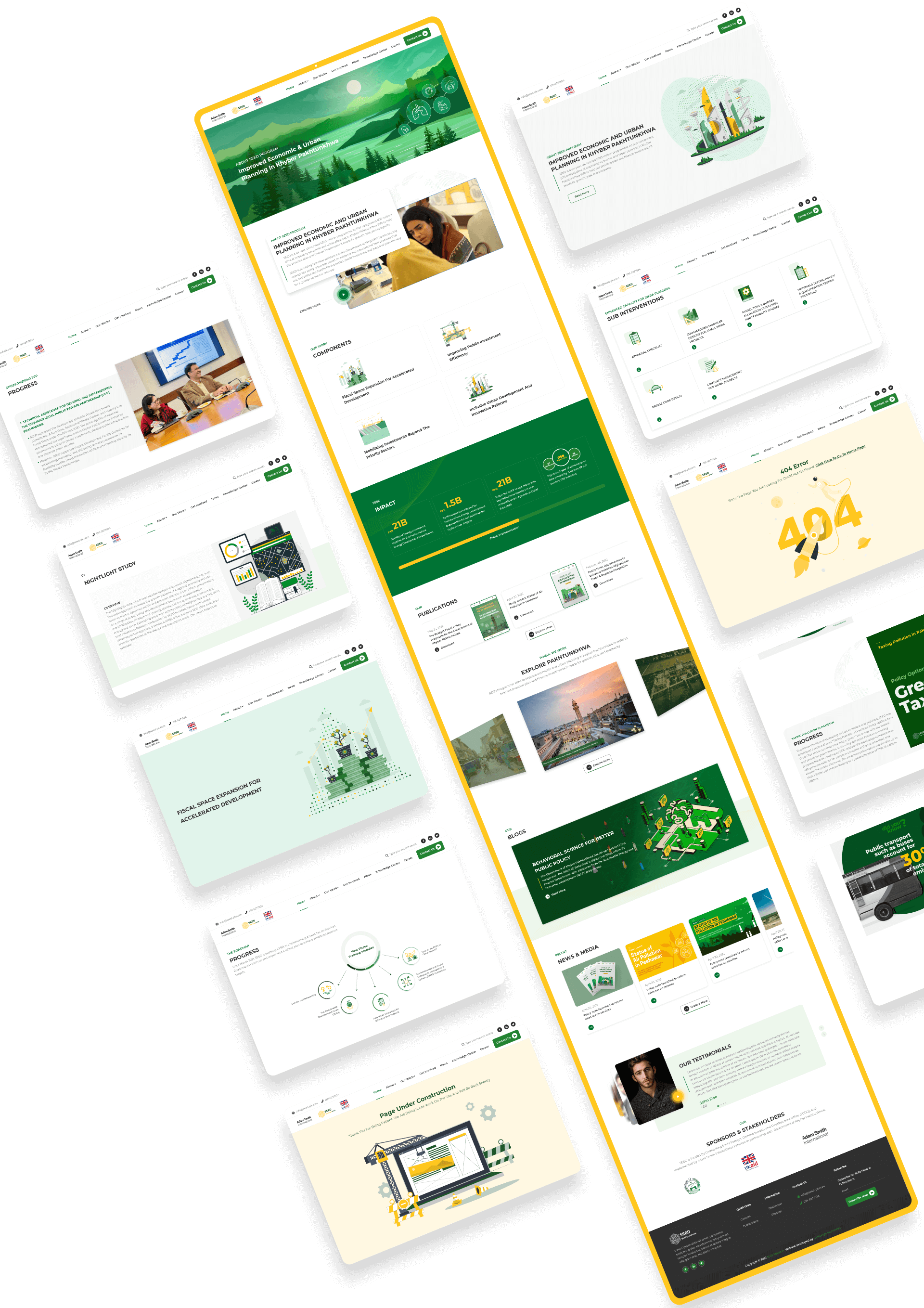

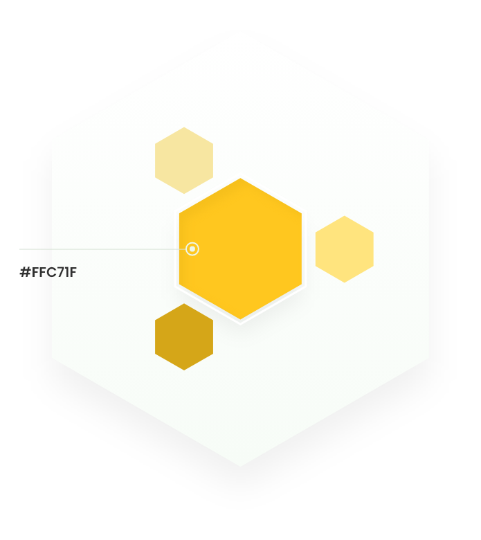
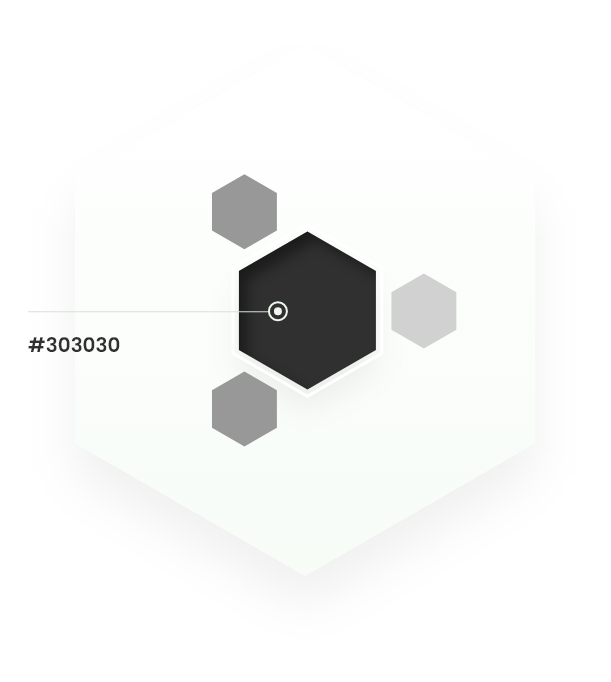
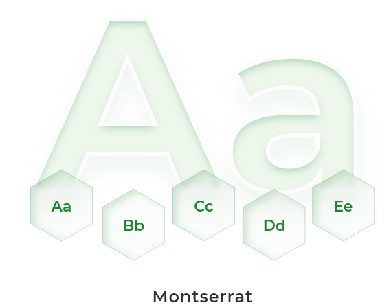
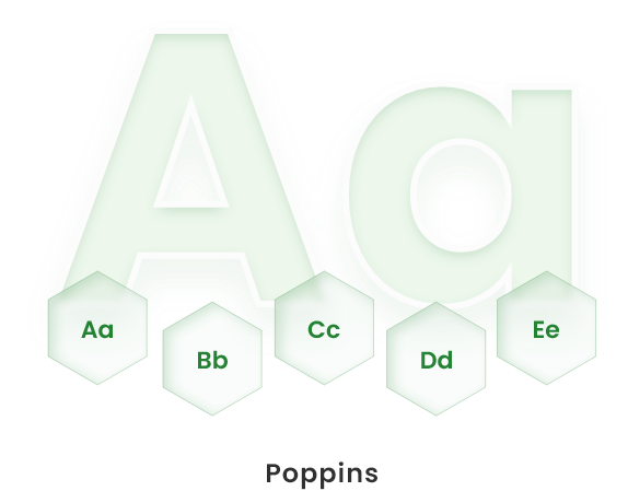
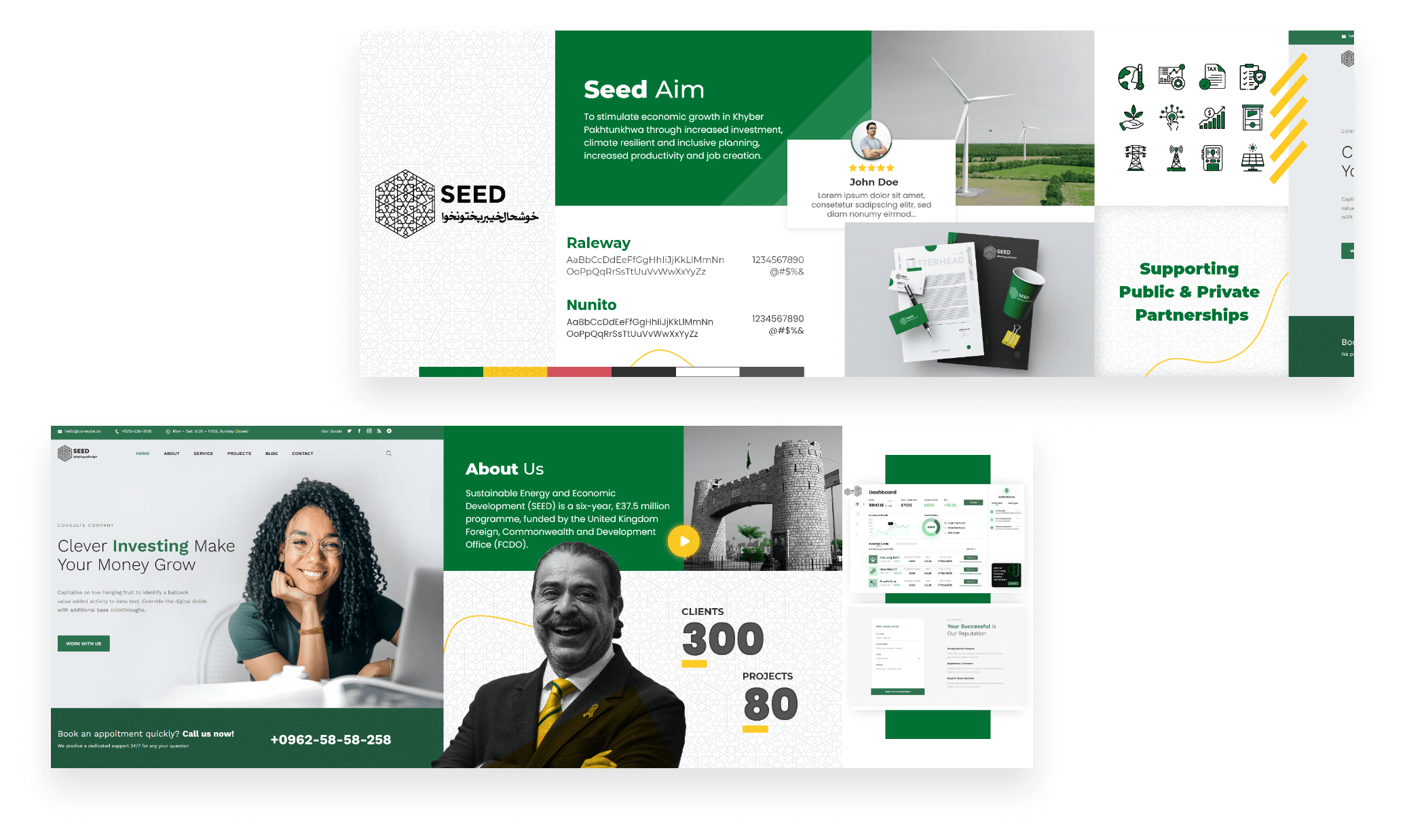
The logo, colors, fonts and overall look and feel of the website are designed to reflect the attributes which highlight the brand’s personality.

After doing the initial meetings and research for finding out the best structure for the website, Centangle finally design a visual idea and create wireframes.
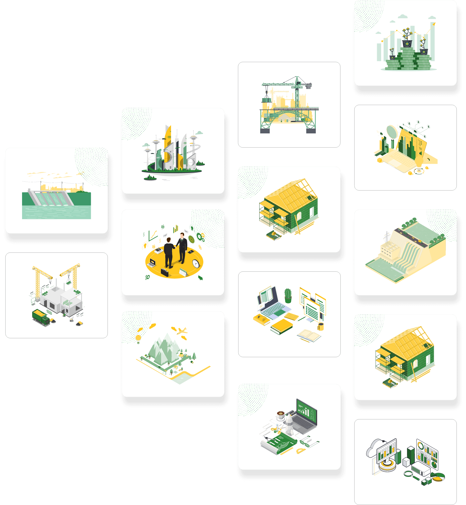
Illustrations which added a layer of Characters, objects, & designs to the website which made the product even more interesting.
We Have created some Web animations to attract attention, engage people better, and communicate more clearly and effectively. Also it can engage and hold people’s attention longer than just a static web page.
If you like the project, please don't forget to appreciate 🙂
3rd Floor, CIS Technology Park, Shahra-e-Jamhuriat, G-5/2, Islamabad, Pakistan
30 N, GOULD ST, STE R, SHERIDAN, WY, 82801
#19, Level 12, DAMAC Ghalia, Lazuward SW, Jumeriah Village Circle, Dubai, UAE
© 2013 – 2025 Centangle Interactive, All Rights Reserved. Made with ❤️ in Pakistan
Get your own free Linktree. The only link in bio trusted by 70M+ people.
© Centangle Interactive Private Limited