
Expanded Programme Scope
SEED’s work had grown across multiple verticals, but the website needed to better represent the programme’s evolving initiatives and areas of focus.

Adam Smith International
A public programme website redesigned to make SEED’s multi-component development work easier to navigate, understand, and communicate.
Project Overview
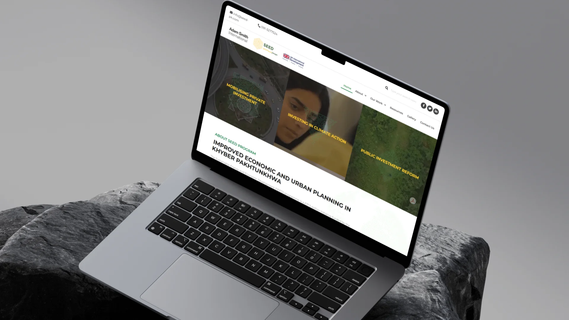
SEED is a UK-funded programme focused on improving economic and urban planning in Khyber Pakhtunkhwa. As the programme expanded across multiple components and stakeholder groups, the website needed a clearer way to present its scope, interventions, stakeholders, and impact areas. The redesign helped turn SEED’s complex programme work into a more organised public digital experience.
The Mandate
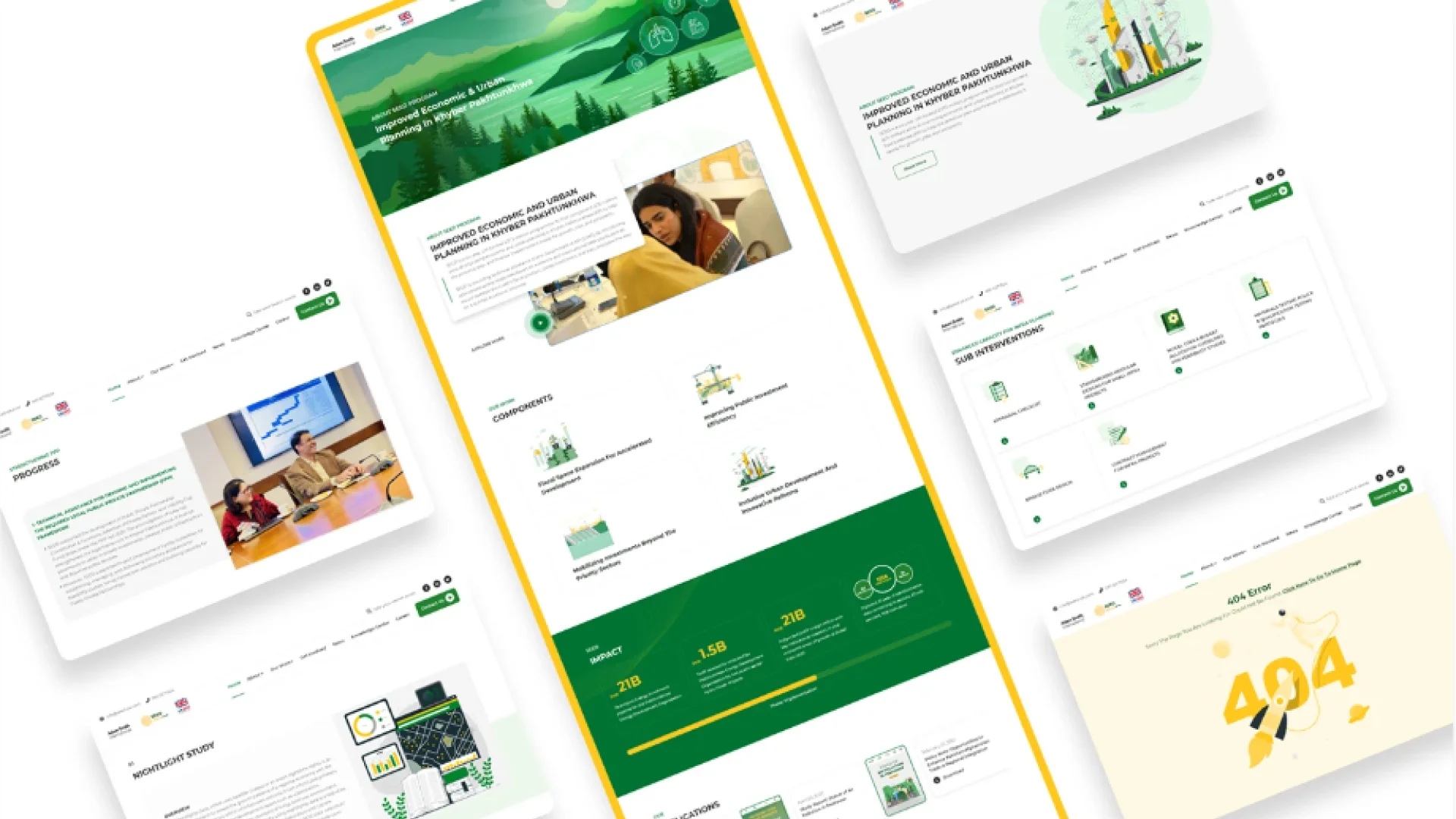
The requirement was to redesign SEED’s website so complex programme information could be easier to navigate, understand, and experience. The platform needed to serve donors, beneficiaries, government stakeholders, partners, and public users, while giving SEED’s programme components a stronger visual and structural identity.
The Environment
SEED’s original website was created at the start of the programme, but the programme had grown across more workstreams, intervention areas, stakeholders, and communication needs. The existing website no longer reflected the full scale of SEED’s work, so users needed a clearer way to understand what the programme does, who it supports, and how its components connect.
Our Role
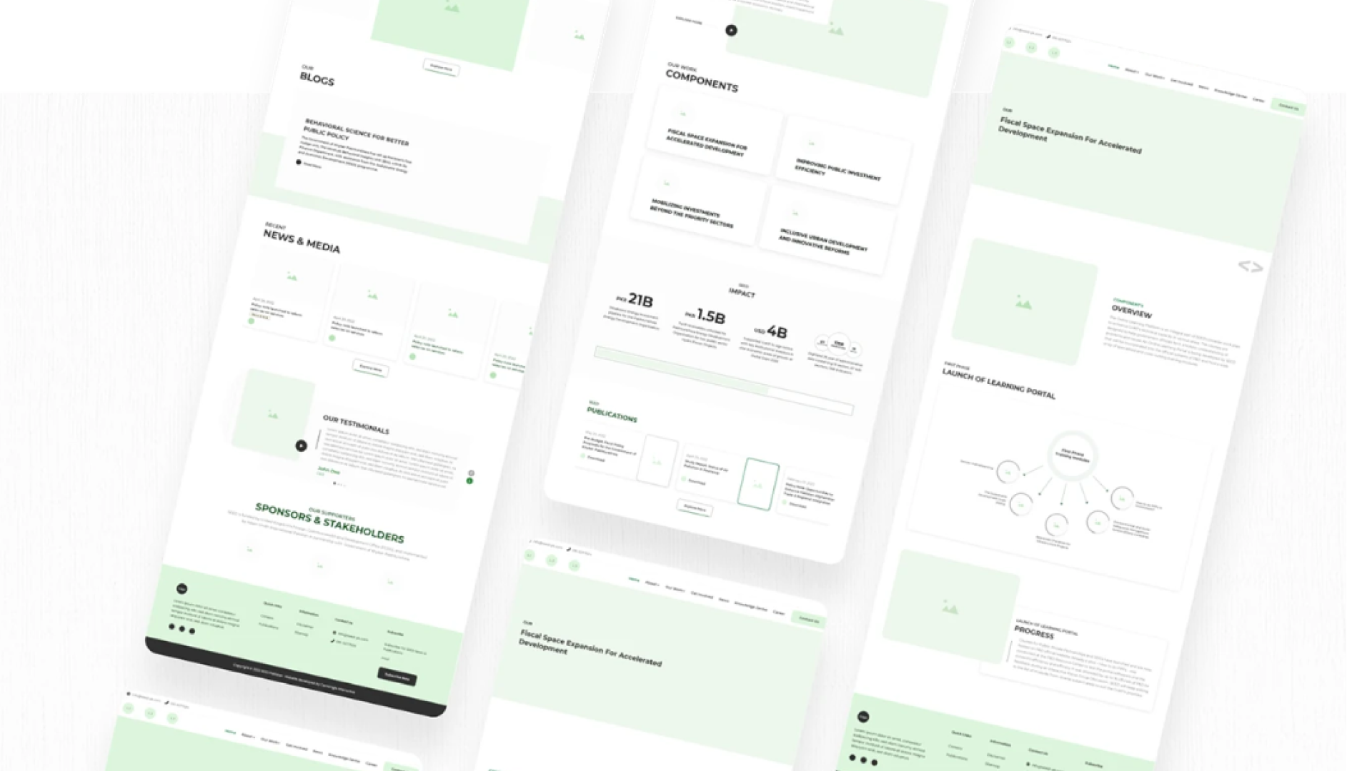
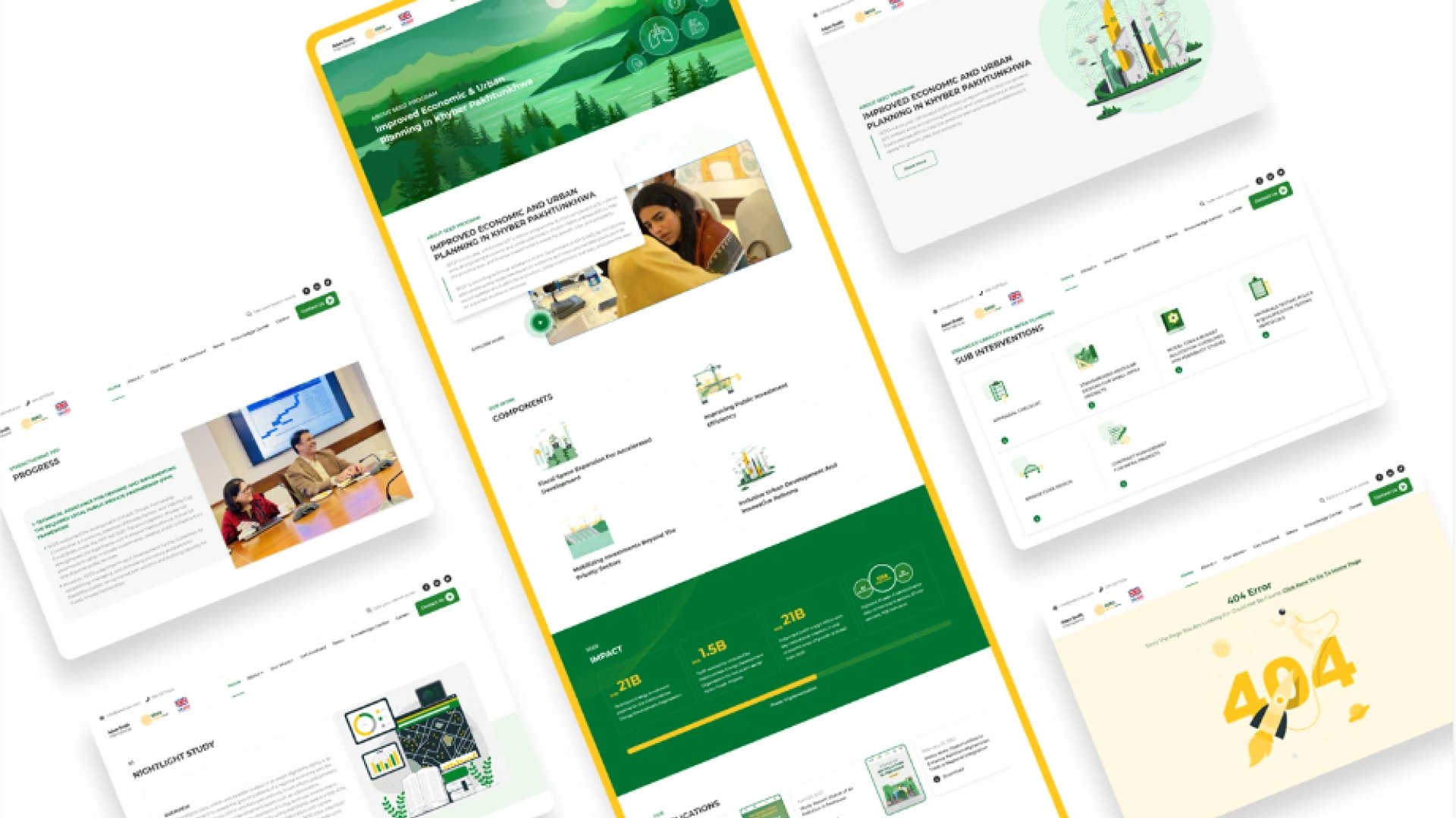
Centangle redesigned the SEED website through a structured process that included stakeholder meetings, sitemap restructuring, wireframes, UI design, style guidelines, vector illustrations, web animations, and website development. The work focused on turning SEED’s multi-component programme structure into a clearer digital experience supported by content hierarchy, visual storytelling, and user journey planning.
The Challenge
SEED’s work had grown across multiple verticals, but the website did not fully reflect the programme’s evolving initiatives.
The challenge was to redesign the website so complex programme information could become easier to understand, navigate, and communicate for donors, beneficiaries, government stakeholders, and wider audiences.
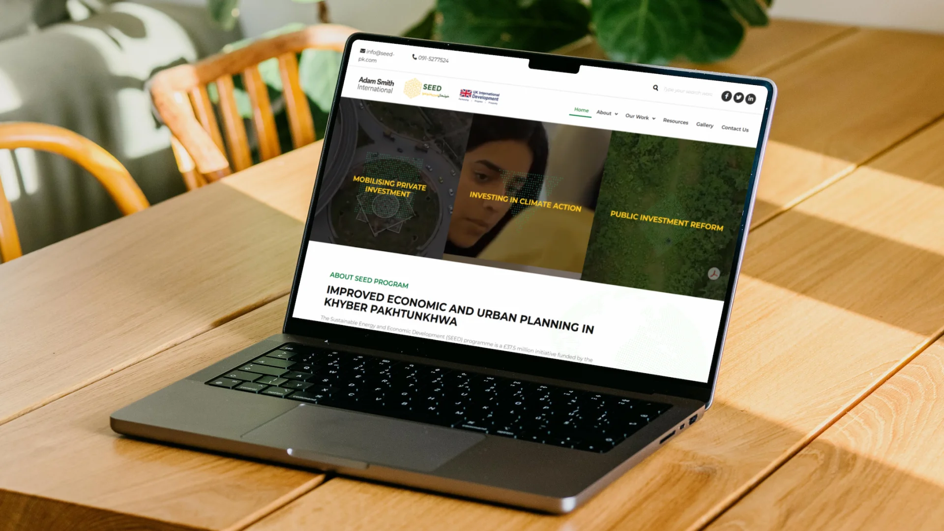
SEED’s work had grown across multiple verticals, but the website needed to better represent the programme’s evolving initiatives and areas of focus.
Programme interventions needed to be divided into smaller, logical sections so users could understand the work without feeling overwhelmed.
The website had to serve different audiences, including donors, beneficiaries, institutional stakeholders, partners, and public users.
The redesign needed to improve how users moved through programme information and understood SEED’s purpose, workstreams, and impact.
The Solution
Centangle redesigned the SEED website to make a large, multi component development programme easier to navigate, understand, and engage with.
System Architecture: SEED Programme Website Redesign
Public Website Experience
Presents SEED’s work through a public website.
Organises programme information into logical sections.
Structures content across website pages.
Defines user movement before final design.
Organises SEED’s components, scope, and interventions.
Supports the website with graphics and animations.
Delivers the website for public communication.
Supports future content updates and changes.
FEATURE 01
Organised SEED’s programme information into a clearer and more logical website structure.
FEATURE 02
Mapped user journeys and page flows before moving into final interface design.
FEATURE 03
Created a consistent visual direction through colours, typography, layout, icons, and components.
FEATURE 04
Used custom visuals and web animations to make programme areas easier to understand.
FEATURE 05
Structured the website around donors, beneficiaries, government stakeholders, partners, and public users.
FEATURE 06
Delivered the redesigned website as a public-facing platform for SEED’s programme communication.
The SEED website redesign followed a structured process that connected stakeholder input, content organisation, user journey planning, visual design, illustrations, animations, and website development.
PHASE ONE
Understanding SEED’s programme scope, stakeholder needs, intervention areas, and communication requirements.
PHASE TWO
Organising SEED’s programme information into a clearer website structure with logical sections and improved navigation.
PHASE THREE
Mapping user journeys and creating wireframes to define how users would move through the website before final design.
PHASE FOUR
Creating the website’s visual direction through style guidelines, colours, typography, iconography, and component treatment.
PHASE FIVE
Developing vector illustrations, web animations, and the final website experience for public use.
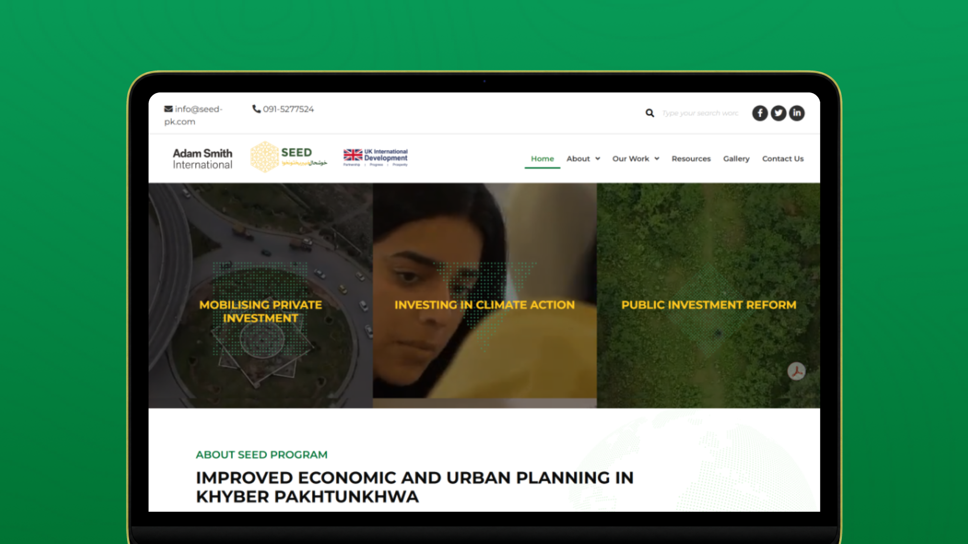
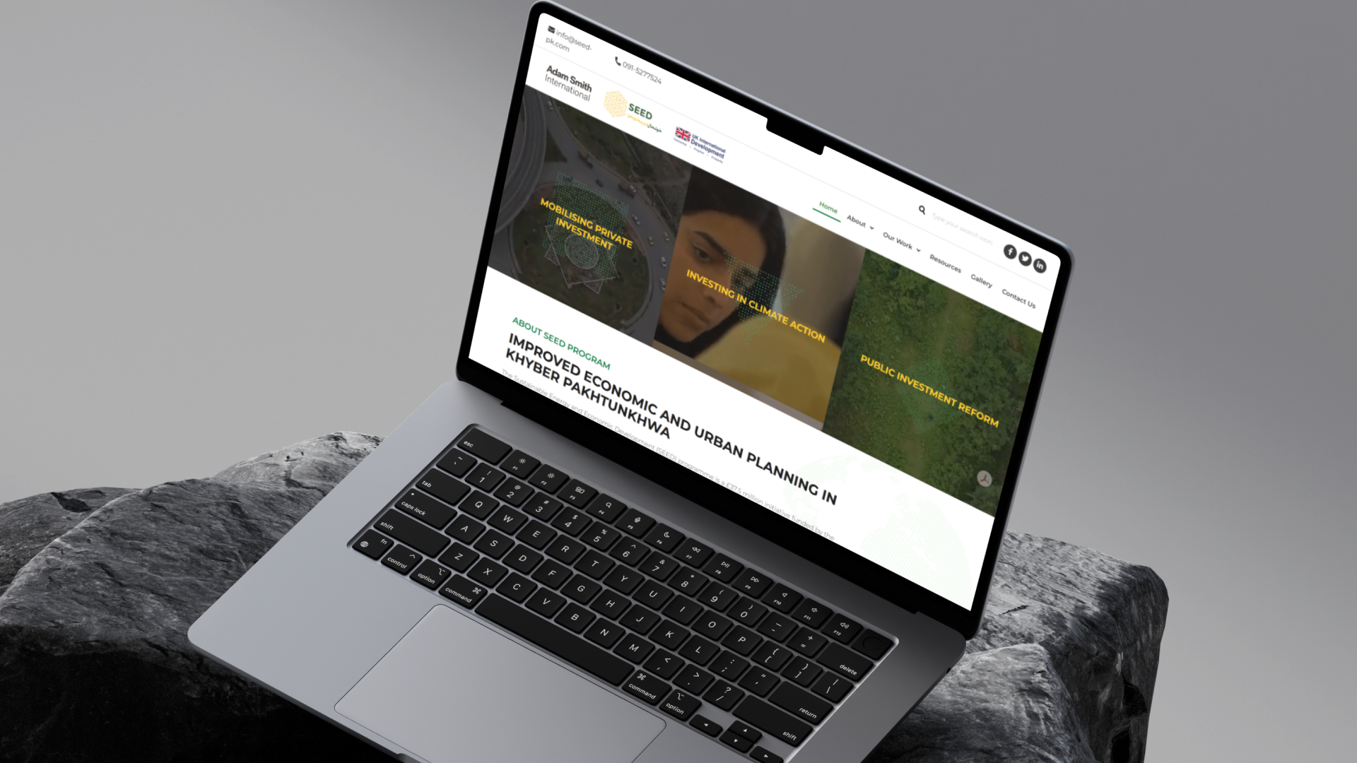
The redesigned SEED website helped translate a large, multi component development programme into a clearer and more navigable digital experience. By restructuring the sitemap, improving user journeys, creating wireframes, defining visual guidelines, and adding custom illustrations and animations, the platform made SEED’s work easier for donors, beneficiaries, government stakeholders, and wider audiences to understand.
Centangle redesigned the SEED website to make programme information, stakeholder journeys, and intervention areas easier to navigate and understand.
Work With Us
Centangle helps development programmes and public sector initiatives redesign digital platforms that improve communication, organise information, and make complex work easier to understand.