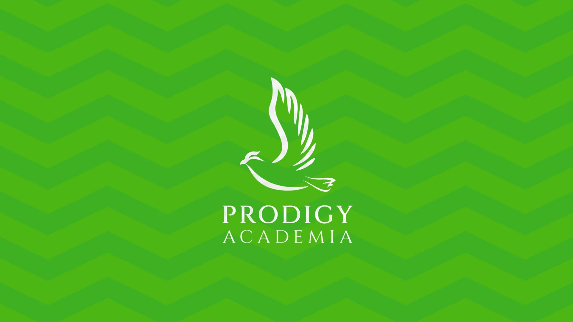

Education-Focused Credibility
The identity needed to feel trustworthy, structured, and suitable for an academic environment.

Prodigy Academy
An education brand identity built to communicate learning, confidence, credibility, and recognition across academic communication and everyday brand collateral.
Project Overview
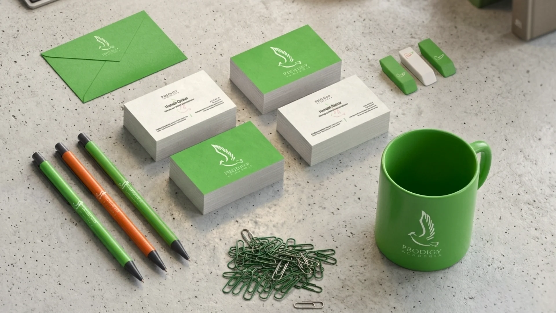
Prodigy Academy needed a brand identity that could communicate learning, confidence, and institutional credibility while still feeling fresh and approachable. Centangle developed a professional visual identity system with a recognisable logo, green-led design direction, stationery applications, and branded collateral that could work across student-facing, digital, and everyday academy touchpoints.
The Mandate
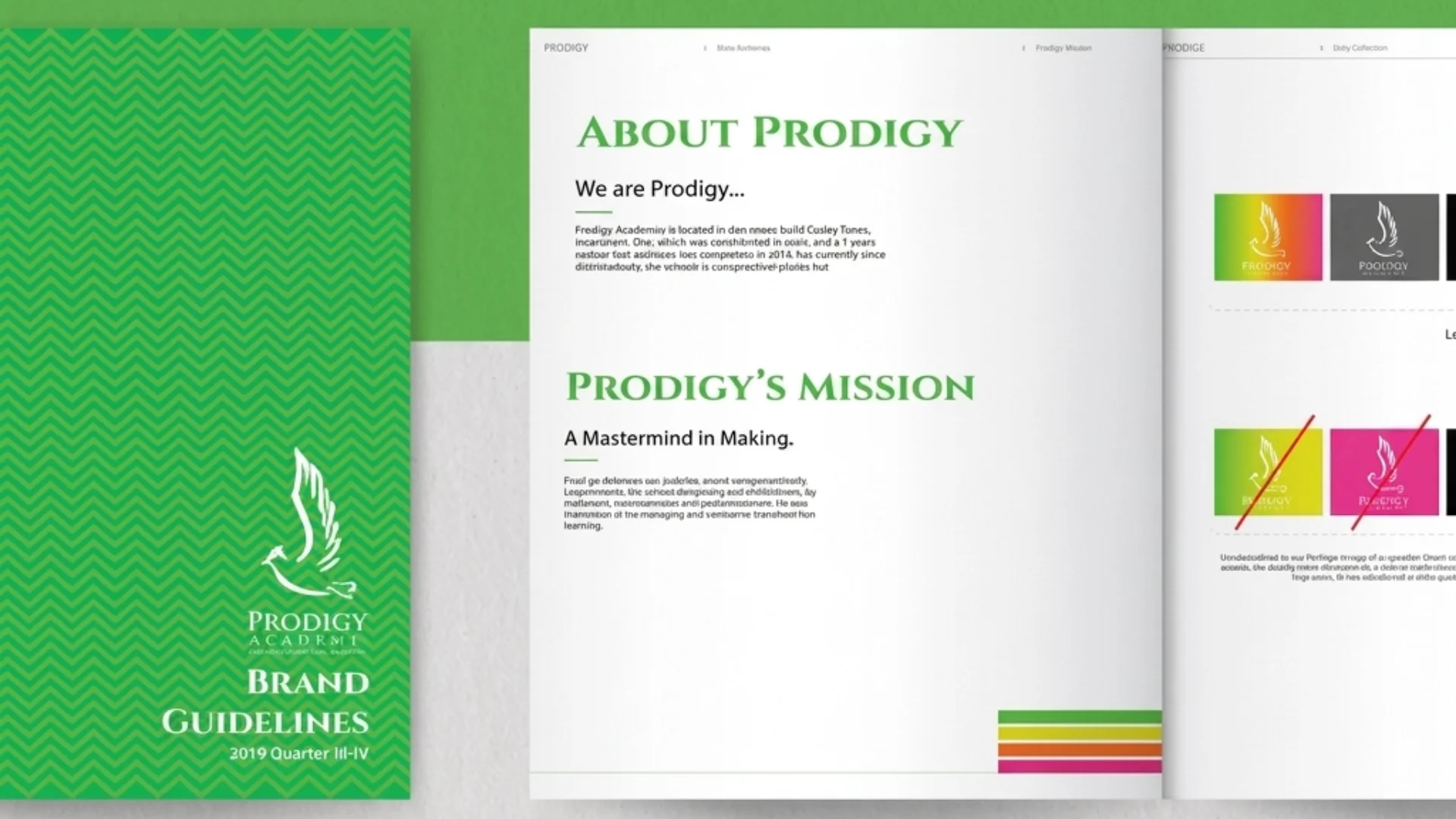
Prodigy Academy required a visual identity that could build trust, recognition, and consistency across academic and communication touchpoints. The objective was to create more than a logo by developing a professional and flexible brand system that could support student-facing, parent-facing, and institutional communication.
The Environment
Education brands need to communicate credibility quickly through a structured, polished, and consistent visual presence. Prodigy Academy needed an identity that could feel academic, professional, and recognisable across print, digital, and everyday brand materials such as stationery, folders, mugs, pens, and communication assets.
Our Role
Centangle developed Prodigy Academy’s logo and supporting brand identity system, including a distinct education-focused logo mark, green-led visual direction, stationery applications, and everyday brand collateral. The final identity helped the academy appear more structured, professional, and institution-ready across its communication materials.
The Challenge
Prodigy Academy needed a brand identity that could communicate learning, confidence, and institutional credibility while still feeling fresh, approachable, and relevant for students. As an education brand, its logo and visual system had to feel professional enough for an academy while remaining simple and memorable across everyday communication.
The challenge was to create an identity that could work across multiple touchpoints, including stationery, student-facing material, digital platforms, and brand collateral. The final direction needed to be distinct, flexible, and practical enough to support both formal academic use and modern visual communication.
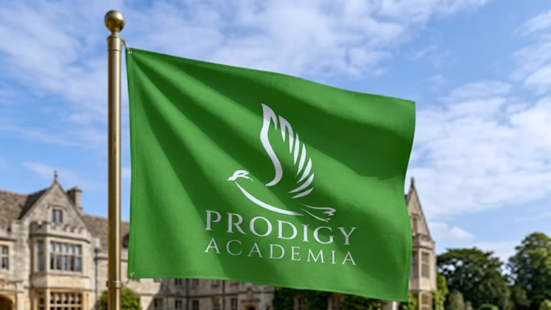
The identity needed to feel trustworthy, structured, and suitable for an academic environment.
The logo had to create a clear and memorable brand mark that could stand out across materials.
The identity needed to work across cards, envelopes, stationery, mugs, pens, and other communication assets.
Prodigy Academy needed a polished visual system that could support student, parent, and institutional communication.
The Solution
Centangle developed a professional brand identity for Prodigy Academy with the logo as the central visual anchor. The identity was extended across stationery, business cards, envelopes, letterheads, mugs, pens, folders, and other branded materials, creating a green-led visual system that helped the academy appear credible, structured, and recognisable across academic and communication touchpoints.
SYSTEM ARCHITECTURE — Prodigy Academy
Education Brand Positioning
Defines the academy’s visual direction around learning confidence, academic credibility, parent-facing trust, and institutional recognition.
Creates a distinct education-focused visual mark that supports brand recognition across academic, print, and digital communication.
Uses a green-led identity direction to communicate growth, trust, freshness, and a structured academic presence.
Supports clean hierarchy, formal presentation, and consistent communication across student-facing and institutional materials.
Applies the identity across business cards, letterheads, envelopes, and official communication material.
Extends the brand system to academic notices, printed material, digital communication, and everyday academy updates.
Carries the identity across mugs, pens, folders, cards, and other office or academy materials used in daily communication.
Shows how the logo, colour direction, and identity system can appear across mockups, collateral displays, and brand examples.
FEATURE 01
Created a distinct education-focused logo mark that gave Prodigy Academy a clear and recognisable visual identity. The logo was designed to feel professional, memorable, and suitable for an academic brand that needs to communicate trust and learning.
FEATURE 02
Defined a professional green-led brand direction to communicate growth, trust, freshness, and academic credibility. The colour direction helped create a consistent visual feel across the academy’s communication materials and brand applications.
FEATURE 03
Extended the identity across business cards, letterheads, envelopes, and formal communication materials. These applications helped Prodigy Academy present itself more professionally in student-facing, parent-facing, and institutional communication.
FEATURE 04
Applied the brand system across practical academy items such as mugs, pens, folders, cards, and other branded materials. This helped the identity move beyond the logo and become visible across everyday academy touchpoints.
FEATURE 05
Created a unified visual language that could work across print, digital, student-facing, parent-facing, and institutional communication. The consistent use of logo, colour, and layout helped the brand feel more connected and recognisable.
FEATURE 06
Helped Prodigy Academy appear more structured, credible, and institution-ready across all brand touchpoints. The final identity gave the academy a polished visual presence that could support trust, recognition, and long-term communication.
The Prodigy Academy branding project followed a creative process focused on translating the academy’s education-focused personality into a professional logo, green-led visual system, and practical brand applications.
PHASE ONE
Understanding Prodigy Academy’s education focus, target audience, communication needs, and desired brand personality.
PHASE TWO
Developing logo concepts that could communicate learning, credibility, confidence, and recognition.
PHASE THREE
Defining the colour-led brand system, layout direction, and overall visual expression for the academy.
PHASE FOUR
Applying the identity across business cards, letterheads, envelopes, mugs, pens, folders, and communication assets.
PHASE FIVE
Preparing the final identity presentation to show the logo, stationery, collateral, and visual system as one complete academic brand identity.
The Prodigy Academy identity helped turn the academy into a more recognisable and professionally presented education brand. By extending the logo across stationery, office collateral, and communication materials, the brand gained a more consistent visual presence for student-facing, parent-facing, and institutional touchpoints.
WORK WITH US
Centangle helps education brands create visual identities that support trust, recognition, and consistent communication across academic touchpoints.