


Brand IdentityLogo DesignStationery DesignVisual BrandingCreative Direction

Logo Design and Branding for Chinkle

Chinkle

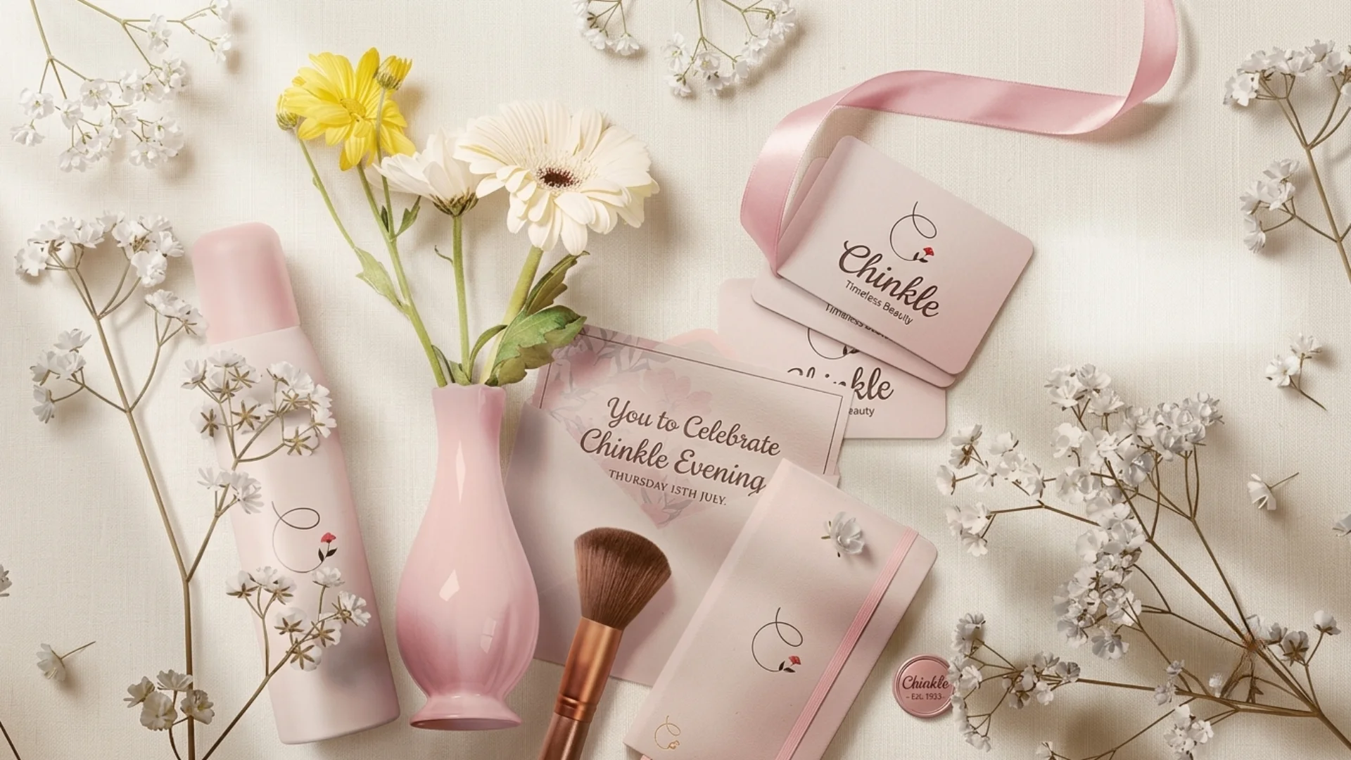
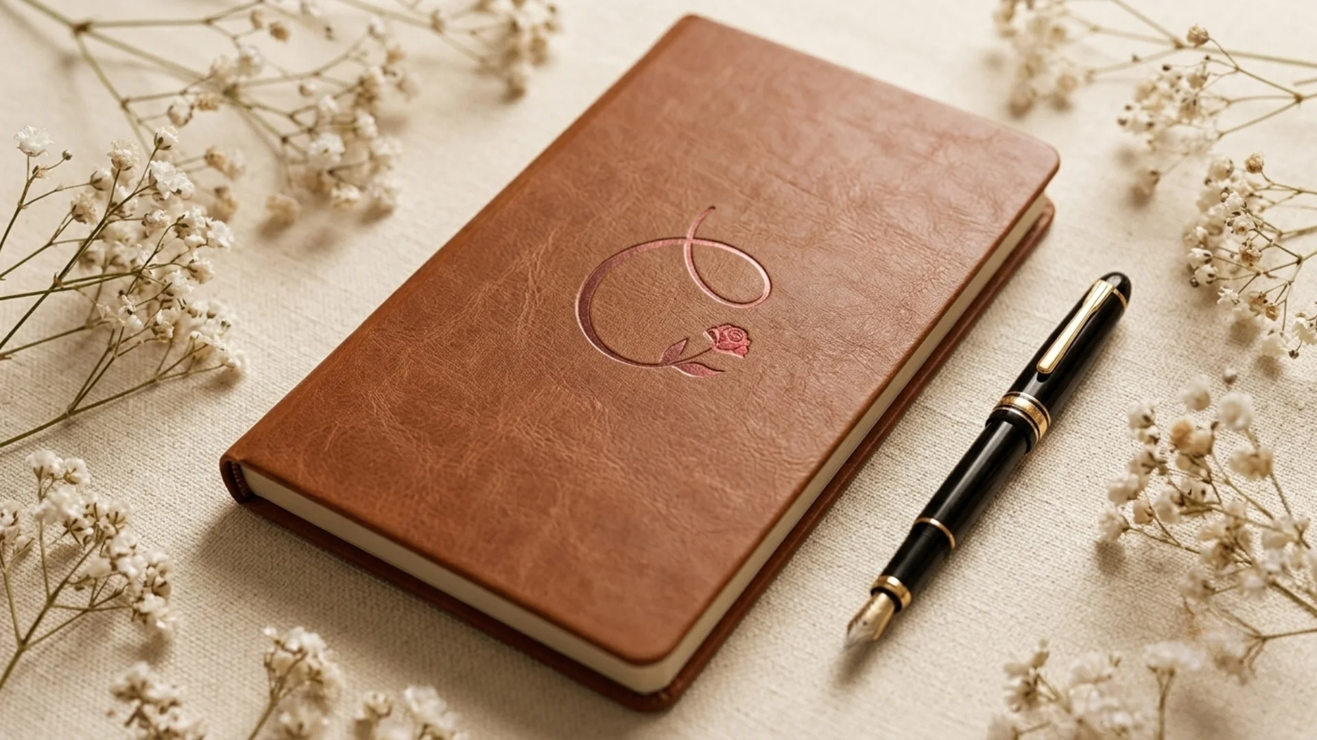
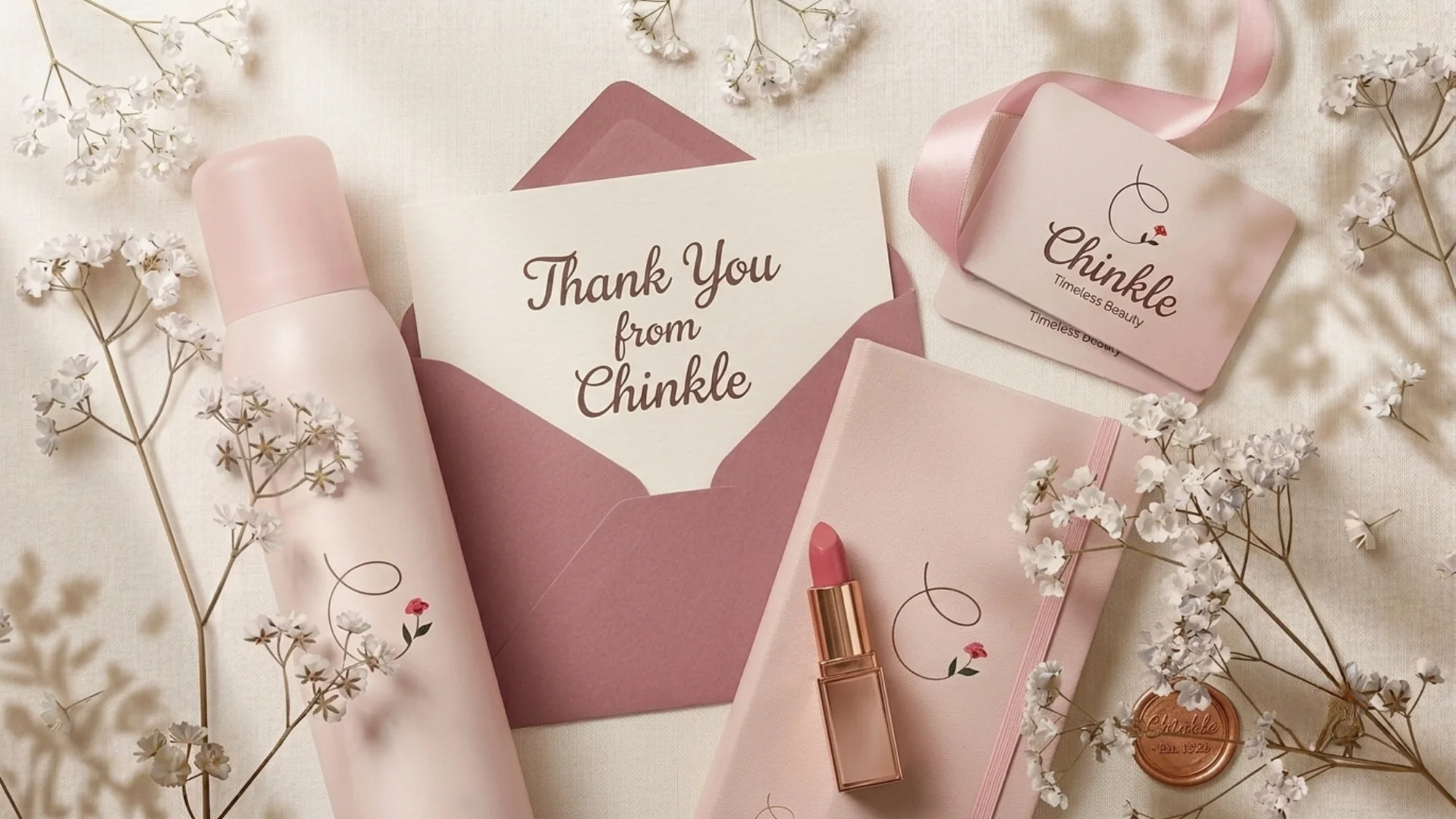
Centangle developed Chinkle’s brand identity through logo design and branding work focused on creating a soft, memorable, and visually distinctive presence for the brand. The identity direction used delicate visual elements, stationery applications, and a minimal brand expression to give Chinkle a polished and recognisable look across touchpoints.

3
Stationery touchpoints
5
Key identity features
Logo Design and Branding for Chinkle

Project Overview

A soft and refined identity system for brand recognition

Chinkle needed a visual identity that could communicate elegance, softness, and memorability through a refined logo and supporting brand applications. Centangle developed a brand identity system that translated Chinkle’s personality into a delicate logo mark, stationery applications, and a cohesive visual presentation, giving the brand a more polished and recognisable presence across practical touchpoints.

A soft and refined identity system for brand recognition
  • The Mandate

    Create a brand identity that feels elegant, clear, and memorable

    Chinkle required a visual identity that could feel polished, distinctive, and memorable while remaining usable across stationery, envelopes, letterheads, brand presentations, and future communication materials. The objective was not only to create a standalone logo, but to build an identity direction that could support brand recall and visual consistency across different touchpoints.

  • The Environment

    A growing brand needed a clearer visual presence

    Chinkle needed a clearer visual presence that could make the brand feel more complete, professional, and easy to recognise. The logo, typography, graphic elements, colours, and stationery applications had to work together so the brand appeared intentional, consistent, and refined without becoming generic or overly complex.

  • Our Role

    Logo design, brand identity direction, stationery design, and visual communication

    Centangle developed Chinkle’s logo and supporting brand identity system, focusing on a distinct visual mark, soft brand expression, stationery applications, and consistent visual direction. The final identity showed how Chinkle could appear across practical communication materials while keeping the brand polished, recognisable, and aligned with its refined personality.

The Challenge

Chinkle needed a distinct identity that felt soft, refined, and memorable

For a brand like Chinkle, visual identity has to do more than look attractive. It needs to create immediate recognition, communicate the right personality, and stay consistent across stationery, printed materials, digital presentation, and everyday brand touchpoints.

The challenge was to develop a logo and brand system that felt elegant, delicate, and polished without becoming generic. The identity needed to give Chinkle a clear visual presence that could feel refined, memorable, and flexible across different brand applications.

Chinkle needed a distinct identity that felt soft, refined, and memorable
  • Creating Visual Distinction

    The brand needed a logo that could feel memorable, refined, and easy to recognise without relying on heavy or overly complex design. The visual mark had to be simple enough for everyday use while still giving Chinkle a distinct identity.

  • Balancing Softness and Clarity

    The identity had to feel delicate, elegant, and expressive while still remaining readable and practical across different formats. The challenge was to keep the brand soft and polished without losing clarity or usability.

  • Extending the Logo Into Brand Touchpoints

    The design needed to translate naturally across stationery, envelopes, cards, printed applications, and digital presentation. Each touchpoint had to feel connected to the same identity instead of looking like separate design pieces.

  • Building a Consistent Brand Feel

    Chinkle required a visual direction that could support a unified presence across future communication materials. The brand system had to create consistency in how the logo, colours, typography, and applications appeared across different uses.

The Solution

A complete visual identity for Chinkle

Centangle developed a refined brand identity for Chinkle with the logo as the central visual anchor. The solution extended beyond logo design into stationery applications, soft floral detailing, delicate spacing, and a cohesive visual presentation, giving Chinkle a complete brand expression that could work across printed and digital touchpoints while maintaining a soft, polished, and memorable identity.

SYSTEM ARCHITECTURE — Chinkle Brand Identity System

  1. PRESENTATION LAYER

    Brand Touchpoint Experience

    • Logo and Brand Presentation

      Presents the primary logo, visual identity direction, brand presentation layouts, and overall look of Chinkle across digital and printed communication.

  2. APPLICATION LAYER

    • Logo Identity System

      Uses the logo as the central visual anchor for Chinkle’s recognition, personality, and brand recall.

    • Visual Language System

      Defines the soft floral detailing, refined spacing, delicate colour treatment, and minimal styling that create Chinkle’s elegant brand mood.

    • Creative Direction System

      Guides the brand’s softness, clarity, polish, and memorability so the identity feels refined without becoming generic.

  3. DATA & INTEGRATION LAYER

    • Stationery Application Framework

      Extends the logo and visual language across cards, envelopes, letterheads, presentation visuals, and future communication materials.

    • Brand Consistency Framework

      Keeps the logo, typography direction, graphic elements, colours, spacing, and presentation style unified across all brand touchpoints.

    • Recognition and Recall System

      Supports a polished and recognisable brand presence by making the identity consistent, memorable, and easy to use across printed and digital materials.

  • FEATURE 01

    Logo Identity System

    Created a distinct logo mark that acts as the central visual anchor for Chinkle’s brand recognition and recall.

  • FEATURE 02

    Soft Visual Language

    Defined a delicate visual style using soft floral detailing, refined spacing, and subtle graphic treatment to reflect elegance.

  • FEATURE 03

    Stationery Design System

    Extended the identity across cards, envelopes, and letterhead-style materials to show how the brand would appear in practical use.

  • FEATURE 04

    Brand Presentation Direction

    Developed a cohesive presentation style that brought the logo, visual elements, and stationery applications together as one complete identity.

  • FEATURE 05

    Creative Direction Framework

    Established a soft, polished, and memorable brand mood so the identity could feel refined without becoming generic or overly complex.

  • FEATURE 06

    Cross-Touchpoint Consistency

    Created a consistent visual system that could support future printed and digital communication while keeping the brand recognisable across touchpoints.

HOW WE DELIVERED IT

Structured delivery from identity direction to brand applications

The Chinkle branding project followed a creative process focused on translating the brand’s personality into a refined logo, soft visual language, and practical stationery applications.

  1. 01

    PHASE ONE

    Brand Understanding and Visual Direction

    Understanding the brand personality, desired mood, visual expectations, and identity direction.

    • Brand personality understanding
    • Visual mood direction
    • Identity requirements
    • Creative direction notes
  2. 02

    PHASE TWO

    Logo Design Exploration

    Developing logo concepts that could communicate softness, elegance, memorability, and visual clarity.

    • Logo concept direction
    • Visual mark exploration
    • Typography direction
    • Logo refinement path
  3. 03

    PHASE THREE

    Brand Identity Development

    Defining the supporting visual language around the logo, including graphic treatment, spacing, tone, and overall presentation style.

    • Brand identity direction
    • Soft graphic treatment
    • Visual consistency approach
    • Brand presentation style
  4. 04

    PHASE FOUR

    Stationery Application Design

    Applying the identity across stationery materials to show how the brand would appear in real communication use.

    • Card design
    • Envelope design
    • Letterhead-style application
    • Stationery presentation
  5. 05

    PHASE FIVE

    Final Brand Presentation

    Preparing the final identity presentation to show the logo, visual elements, and stationery system as one cohesive brand identity.

    • Final logo identity
    • Brand stationery visuals
    • Visual identity presentation
    • Brand application direction
Measured Impact

What changed after the Chinkle identity was developed

The Chinkle identity helped translate the brand from a name into a clearer visual presence. Through logo design, stationery applications, and a cohesive visual direction, the brand gained a more polished and consistent expression for communication and presentation.

Before

  • Chinkle needed a clearer visual identity to support brand recognition.
  • The brand required a logo that could feel soft, refined, and memorable.
  • Stationery and communication materials needed a more consistent visual direction.
  • The brand needed a visual system that could work across printed and digital touchpoints.
  • The identity needed to feel elegant without becoming visually generic.

After

  • Chinkle gained a distinct logo mark as the anchor of its identity.
  • The brand identity was extended into stationery and presentation materials.
  • Soft visual detailing created a refined and memorable brand mood.
  • The identity became more consistent across brand applications.
  • The brand gained a more polished and professional visual presence.

WORK WITH US

Need a brand identity that feels complete?

Centangle helps brands create visual identities that improve recognition, support communication, and make brand presence feel more complete across touchpoints.