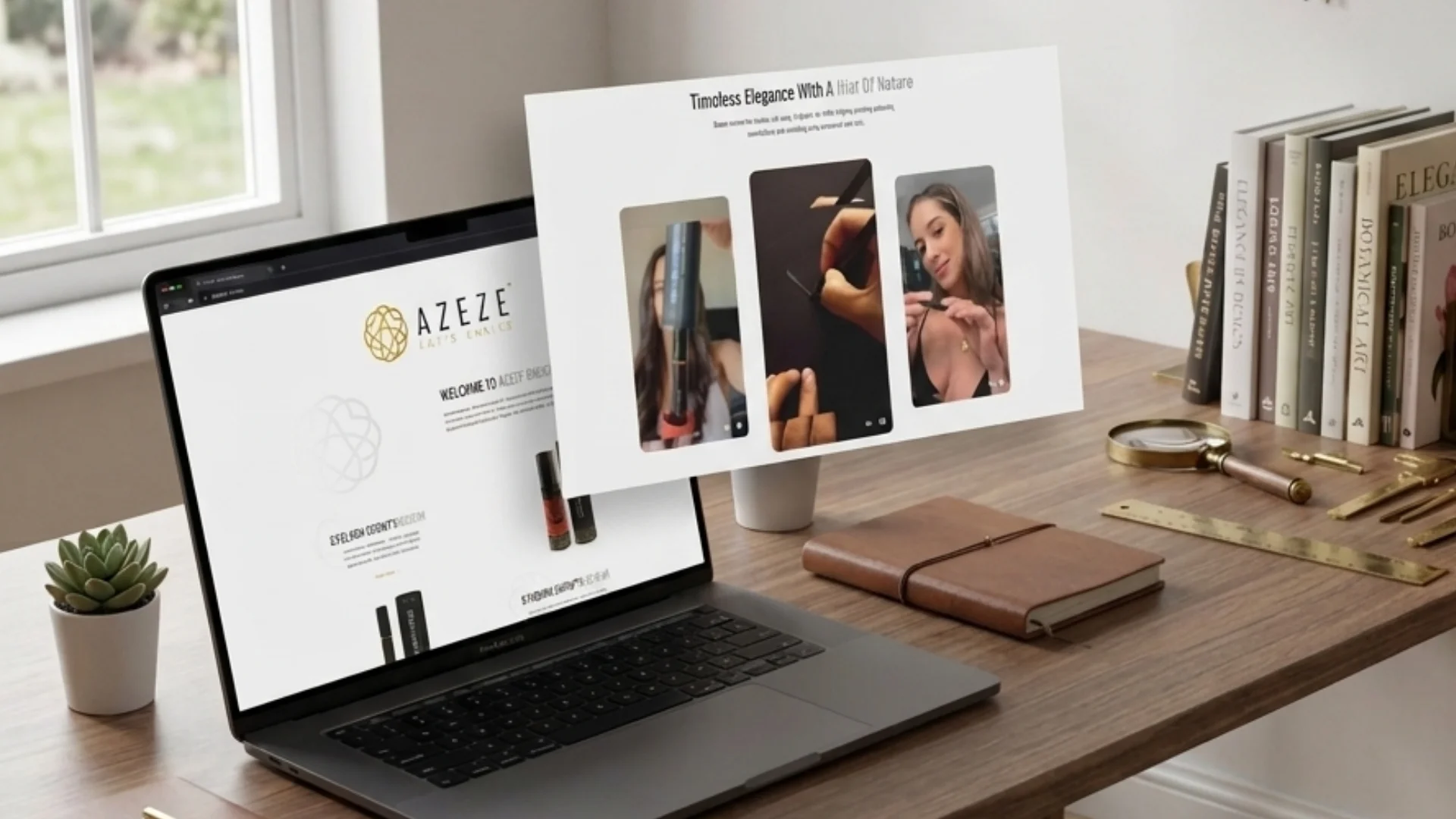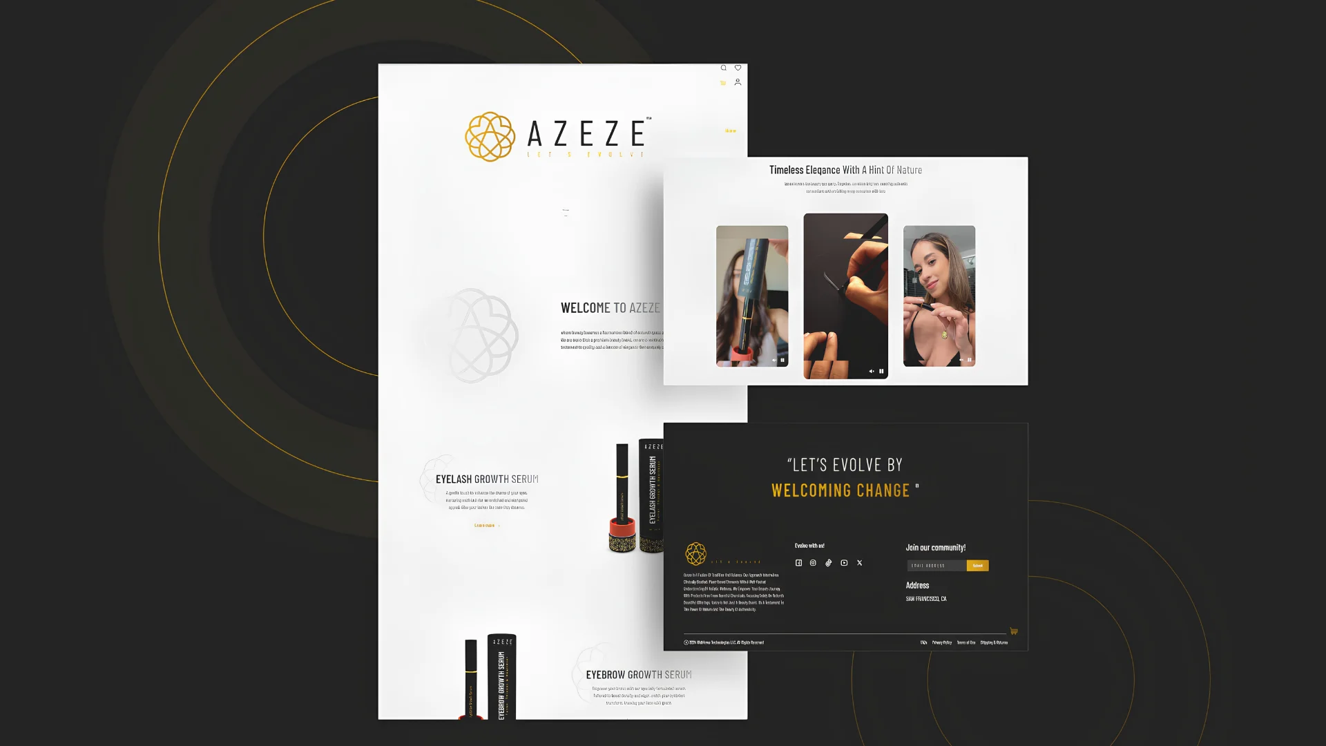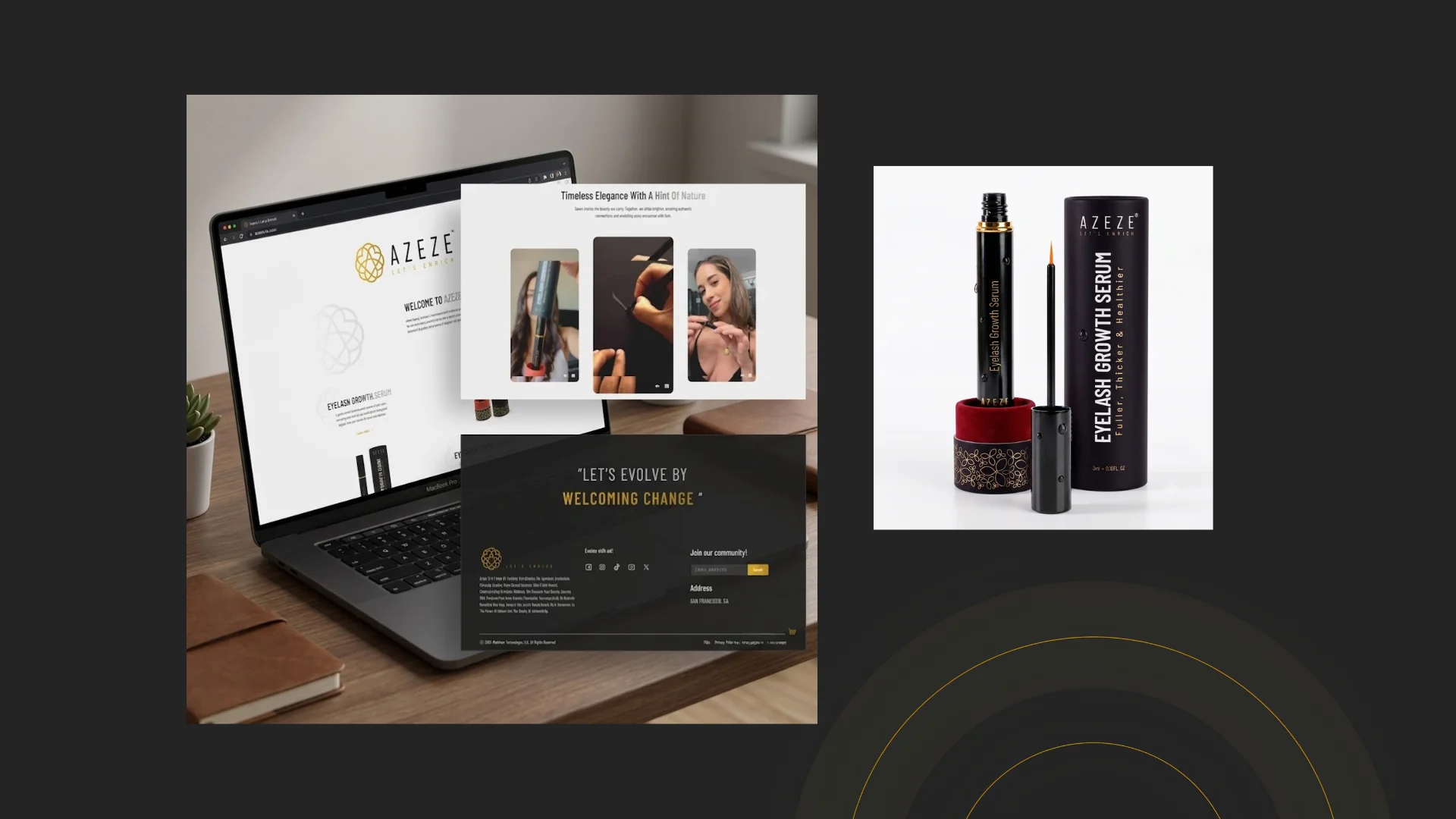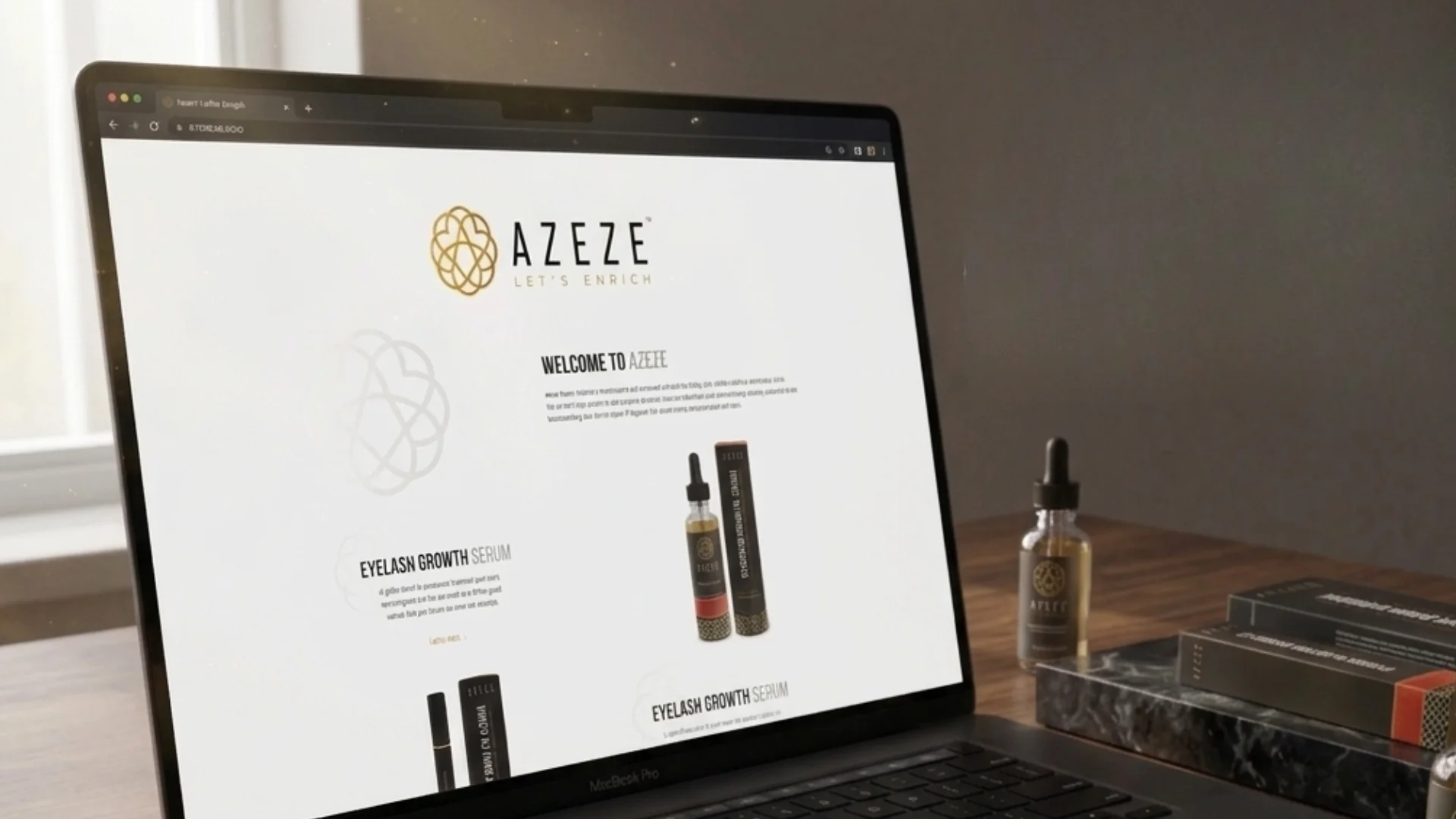

Design Accuracy
The developed website needed to stay faithful to the approved visual direction, including spacing, alignment, typography, imagery, and visual hierarchy.

Azeze
A polished beauty brand website built with visual precision, responsive performance, and brand-consistent frontend execution.
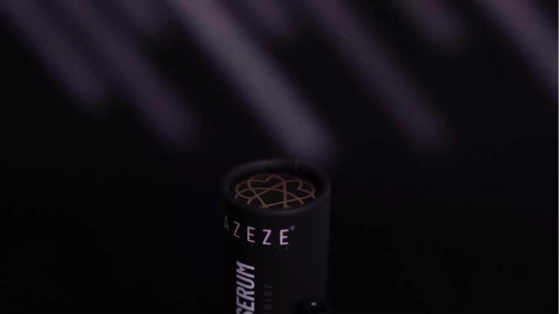
PROJECT OVERVIEW
The beauty brand needed a website that could reflect its visual identity with the same level of care expected from the category itself. In beauty and skincare, the website is often the first place where customers assess product quality, brand trust, and overall credibility. Centangle developed the website with a focus on precision, consistency, and responsive execution. The platform translated the brand’s design direction into a clean digital experience where product content, imagery, layout, and navigation could work together smoothly.
The Mandate
The requirement was to develop a website that closely matched the approved design direction while ensuring responsiveness, usability, and frontend consistency. The goal was not only to build a functional website, but to preserve the visual details that give a beauty brand its premium digital feel.
The Environment
Beauty brands rely heavily on presentation. Product imagery, spacing, typography, colours, and page flow all influence how users perceive quality. Even small inconsistencies in development can make the final website feel less polished than the design intended. The environment required careful frontend development so that the live website could match the brand’s visual identity, support mobile browsing, and create a consistent experience for users discovering the brand online.
Our Role
Centangle developed the Azeze website with a focus on pixel level accuracy, responsive behaviour, interface consistency, and brand aligned execution. The team focused on frontend precision, layout consistency, visual hierarchy, and cross device testing to ensure the final website felt polished across desktop, tablet, and mobile.
THE CHALLENGE
The core challenge was to turn a polished design into a developed website without losing the details that made the brand feel refined. For a beauty brand, spacing, alignment, image treatment, typography, and page rhythm all contribute to the overall impression of quality.
The website also needed to stay consistent across devices. A layout that looks strong on desktop can lose impact on mobile if responsiveness is not handled carefully. The challenge was to preserve the brand experience while making the website usable, structured, and reliable across screen sizes.
The developed website needed to stay faithful to the approved visual direction, including spacing, alignment, typography, imagery, and visual hierarchy.
The experience had to work smoothly across desktop, tablet, and mobile while preserving the brand’s premium look and feel.
The digital experience needed to reflect the visual expectations of a beauty brand, where polish and trust are closely connected.
The website needed a clean structure that allowed users to understand the brand, explore product information, and move through the experience easily.
THE SOLUTION
Centangle developed the Azeze website with a strong focus on frontend precision, ensuring the final build reflected the approved design direction as closely as possible.
System Architecture — Azeze Website
Brand Website UI
Homepage, product sections, brand story, visual content, navigation, and mobile browsing through a polished responsive interface.
Manages page layouts, content sections, navigation flow, responsive behaviour, and reusable website components.
Translates approved design into accurate spacing, typography, imagery, colours, and frontend presentation.
Supports page updates, product content, brand messaging, imagery, and website content management.
Centralises website copy, product information, imagery, brand assets, and page content.
Supports responsive testing, browser checks, layout validation, and frontend quality assurance.
Connects website activity, visitor behaviour, page performance, and engagement insights.
Manages website deployment, live environment setup, maintenance support, and post launch refinements.
FEATURE 01
The website was developed to closely match the approved design direction, preserving layout, spacing, typography, imagery, and visual hierarchy.
FEATURE 02
The layout adapts across desktop, tablet, and mobile, ensuring the beauty brand maintains a polished look across every screen size.
FEATURE 03
Colours, imagery, typography, and page styling were implemented to reflect the brand’s refined beauty category identity.
FEATURE 04
Pages were organised to present brand information, product content, and visual storytelling in a clear and easy-to-navigate flow.
FEATURE 05
Dedicated content areas support product highlights, benefits, imagery, and brand messaging in a visually engaging format.
FEATURE 06
The website was tested across devices and browsers to ensure layout consistency, responsive behaviour, and a smooth user experience.
The website was delivered through a development process focused on understanding the design direction, planning responsive layouts, building the frontend, testing across devices, and refining the final experience.
PHASE ONE
Understanding the approved designs, brand styling, imagery, typography, spacing, page hierarchy, and website structure.
PHASE TWO
Planning the website sections, components, layout behaviour, navigation, reusable blocks, and responsive breakpoints.
PHASE THREE
Developing the website with attention to visual accuracy, spacing, typography, image treatment, interface details, and brand consistency.
PHASE FOUR
Testing the website across devices, browsers, and screen sizes to ensure layout consistency, usability, and presentation quality.
PHASE FIVE
Preparing the website for deployment and supporting final adjustments where required after review.
The project helped the beauty brand move from approved visual direction to a developed, responsive, and professionally presented website experience. By translating the design into a live digital interface, the website strengthened brand presentation, improved browsing consistency, and created a more polished customer facing presence.
A pixel perfect beauty brand website developed to strengthen Azeze’s online presence, improve brand presentation, and create a polished customer-facing digital experience.
WORK WITH US
This beauty brand website shows how approved design, responsive development, and pixel perfect execution can come together to create a polished digital experience. Centangle helps brands build websites that look refined, work smoothly, and communicate clearly across devices.