



10min read
More features can make a product look more valuable before people use it—and harder to navigate afterward. In a 2005 study, Thompson, Hamilton and Rust described this tension as feature fatigue: capabilities attract attention during product selection, while usability becomes more important through actual experience.
Software teams face this dilemma whenever a customer requests another dashboard, a competitor launches a new tool, or an internal team wants an additional setting. Each request might be reasonable. Together, however, they can produce feature bloat: software that does more but makes essential tasks harder.
The answer is not to stop innovating. It is to make deliberate choices about what to build, improve, consolidate or retire. This guide explains the UX risks, introduces a five-step prioritisation framework and shows how to apply it to a realistic product decision.
What Is Feature Bloat in Software?
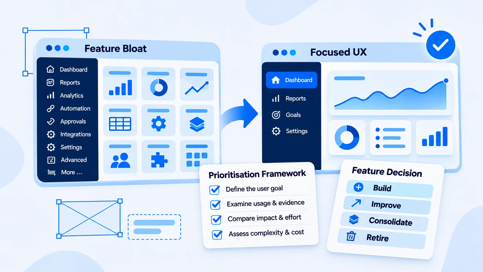
Feature bloat occurs when additional software functionality creates complexity disproportionate to the value it delivers. It can appear as overlapping features, crowded navigation, advanced controls in basic workflows or settings that few people understand.
Feature bloat differs from feature creep. Feature creep describes the gradual expansion of product requirements or scope. Feature bloat describes the resulting excess complexity when capabilities are poorly integrated or no longer justify their burden. A product can experience feature creep without becoming bloated if the additions address real needs and remain usable.
For example, a project management platform might legitimately need approvals, reporting and automation. The problem begins when those specialist controls obscure simple actions such as assigning a task or checking a deadline.
How Feature Bloat Affects User Experience
More functionality is not inherently harmful. The UX problem arises when users must navigate complexity that does not help them complete their work.
Cognitive effort increases. When every screen presents multiple competing choices, users spend more attention interpreting the interface. Nielsen Norman Group’s usability heuristics support keeping information relevant, recognisable and appropriately prioritised.
Discoverability declines. Important actions may be buried under new menus or described using inconsistent labels. A request for a new tool can actually signal that users cannot find an existing one.
Workflows slow down. Extra prompts, filters and confirmation steps can interrupt frequent tasks. A powerful system still creates friction if employees need workarounds for everyday actions.
Maintenance becomes harder. Every capability brings testing, documentation, support and potential integration dependencies. Low-value features can consume resources needed for reliability and usability improvements.
The appropriate response is not always removal. Clear navigation, sensible defaults and role-specific controls may preserve advanced functionality without overwhelming everyone else.
Six Signs Your Software May Have Feature Bloat
Look for patterns in user behaviour, not just the number of features:
- Users routinely ask where existing functions are located.
- Several screens or tools offer largely overlapping actions.
- Common tasks require avoidable clicks, settings or approvals.
- Intended users rarely adopt new features despite adequate onboarding.
- Support teams repeatedly explain routine processes.
- Roadmaps celebrate features shipped without assessing user outcomes.
These are investigation signals, not automatic grounds for deletion. A feature used only occasionally might still be critical to an administrator, accessibility workflow or compliance requirement.
To diagnose the signals, follow a high-frequency user journey from beginning to end. Note where users hesitate, which support questions recur and whether the needed feature already exists. This avoids confusing poor discoverability with a genuine gap in functionality.
How to Prioritise Software Features: A Five-Step Framework
Feature prioritisation works best when it evaluates the underlying problem, the available evidence and the full cost of a solution—not simply how many stakeholders request it.
1. Define the User’s Actual Goal
Start by describing the task users want to complete. If managers request a new reporting dashboard, ask whether the necessary information is missing or merely difficult to find.
Document who experiences the issue, when it occurs, what blocks progress and what a successful outcome would look like. The same complaint can lead to very different solutions: clearer navigation, improved filters, better training or genuinely new functionality.
Avoid writing a development requirement before validating the user problem.
2. Examine Usage and Qualitative Evidence
Review analytics alongside interviews, usability testing and support requests. Useful signals include feature discovery, adoption among intended users, task completion, error frequency and repeat engagement.
Interpret numbers by user segment. A specialist feature may have low overall usage but high importance for the people who depend on it. Conversely, high usage does not prove a workflow is well designed; users might have no alternative.
Establish a baseline relevant to the problem. If people cannot locate reports, observe whether they find and open the correct report without assistance.
3. Compare Impact, Confidence and Effort
Evaluate more than one possible solution. Intercom’s RICE prioritisation framework considers Reach, Impact, Confidence and Effort to make trade-offs more explicit.
Reach asks how many users benefit. Impact considers the expected improvement. Confidence tests the strength of the supporting evidence. Effort captures the resources needed to deliver the change.
Use scoring to guide discussion, not replace judgement. Security, accessibility and regulatory requirements may deserve priority regardless of a score. A navigation improvement affecting a critical daily task may be more valuable than an elaborate feature with uncertain demand.
4. Assess the Long-Term Complexity Cost
Estimate what the change introduces beyond initial development: new navigation, training, documentation, testing, support, permissions, integration dependencies and maintenance.
A 2021 study in Nature found that people often overlook subtractive changes when seeking improvements. Although it was not a software-specific feature-bloat study, it offers a useful prompt: could simplifying or combining what already exists solve the problem?
Compare building new functionality with improving existing workflows before committing resources.
5. Prototype, Test and Reassess
Test the most promising option with representative users. A clickable prototype can reveal confusing labels, hidden controls or unnecessary steps before full development.
Choose outcome measures that match the task: successful completion, time on task, errors, requests for help or feature adoption. Compare results with the baseline after release, while accounting for other changes that may affect performance.
Keep reviewing the experience. A useful feature today can become redundant as the product evolves.
Worked Example: New Dashboard or Better Navigation?
The following scenario is illustrative, not a measured Centangle client result.
An operations platform receives repeated requests for a new performance dashboard. Interviews reveal that managers struggle to prepare their weekly reports. Before adding functionality, the team compares two options:
| Decision factor | Build a new dashboard | Improve the existing dashboard |
|---|---|---|
| User need | May support genuinely missing reports | May make existing reports easier to locate |
| Evidence to gather | Are required metrics unavailable? | Can managers find current reports and filters? |
| Development impact | New screens, permissions and maintenance | Changes to existing navigation and controls |
| UX risk | Duplicate destinations and more choices | Disruption to familiar workflows |
| When to choose | A distinct reporting need is validated | Needed information already exists but is hard to access |
Suppose testing shows that managers already have the required information, but frequently overlook the relevant filters. A redesigned reporting journey becomes the stronger hypothesis. The team can prototype it and measure whether users locate reports more successfully.
If the research instead uncovers genuinely missing metrics, a new dashboard may be justified. The right decision follows the evidence—not a rule that fewer features are always better.
Before releasing either option, the team should agree on a success measure—for example, whether managers can locate and configure their weekly report without assistance. This ties evaluation to a user outcome rather than the number of dashboards delivered.
The Build, Improve, Consolidate or Retire Decision Matrix
After evaluating new requests, apply the same discipline to existing functionality.
| Decision | Use it when | Validate first |
|---|---|---|
| Build | An important need cannot be met by current features | User demand, feasibility and ongoing cost |
| Improve | A useful feature creates friction or is difficult to discover | Task success and usability problems |
| Consolidate | Several functions substantially overlap | User roles, dependencies and migration needs |
| Retire | A feature offers limited value relative to its burden | Specialist users, contractual and operational risks |
Retirement needs particular care. Low usage is not the same as low value. Communicate changes and plan alternatives where removing functionality affects established workflows.
When Adding a Feature Is the Right Decision
A feature deserves development when it solves a validated problem, enables a necessary workflow or improves a meaningful outcome that existing tools cannot deliver. Some products legitimately require substantial complexity, especially when different user groups perform specialised tasks.
The design challenge is to make that capability understandable. For example, advanced controls can appear contextually rather than competing with core actions on every screen.
A role-based interface is one possible response. Finance administrators may need approval controls that frontline employees rarely use. Showing those controls to the appropriate people preserves necessary capabilities while reducing visual competition for others. That is better than deleting important options merely to create a cleaner screen.
The goal is not minimalism for its own sake; it is complexity that earns its place.
Research-Led UX in Practice: A Centangle Example
Centangle’s Financial Freedom Budget App UI/UX Design case study describes an education/research project involving budgeting, expense tracking, bills, goals and financial insights. The work included user research, personas, feature planning, user flows and interface design to organise varied financial tasks within a mobile experience.
It demonstrates an approach to making complex functionality understandable; it does not establish that specific features were removed or that adoption increased by a measured amount.
Similar challenges arise in larger organisations. Centangle’s guide to enterprise digital platform development discusses connecting workflows and systems instead of treating every requested application as an isolated project.
Practical Feature Audit Checklist
Review each important feature against these questions:
- What task does it support, and who relies on it?
- Do intended users find and complete that task successfully?
- Does it overlap with another capability?
- Could a simpler workflow deliver the same outcome?
- What are its support, maintenance and integration costs?
- Would changing it affect accessibility, security or specialist users?
- What evidence would justify keeping, improving or retiring it?
Record an owner, the evidence and a proposed decision. Revisit uncertain items after user testing rather than removing them based on assumptions.
Better Software Starts With Better Priorities
Feature bloat usually grows through individually reasonable additions that are never assessed together. Strong product teams continually balance new capabilities with the usability and reliability of what already exists.
Not sure whether your product needs another feature or a clearer experience? Explore Centangle’s UI/UX, Product Design & Digital Experience services to see how product discovery, journey mapping and usability reviews can help reveal friction and clarify what to improve next.
Frequently Asked Questions
What is feature bloat in software?
Feature bloat is excessive or poorly integrated functionality that introduces more complexity than value for intended users. It often affects navigation, workflows and maintenance.
What is the difference between feature bloat and feature creep?
Feature creep is the gradual expansion of product requirements. Feature bloat is unnecessary complexity in the resulting software; the former can contribute to the latter.
How do you decide which software features to remove?
Assess user importance, adoption, usability, dependencies and maintenance cost. Consult affected users and test alternatives before retiring functionality.
How can teams measure whether a feature improves UX?
Select measures tied to the user task, such as completion, errors, time on task and requests for help. Compare results before and after release alongside qualitative feedback.
Key Takeaways
- What Is Feature Bloat in Software?
- How Feature Bloat Affects User Experience
- Six Signs Your Software May Have Feature Bloat
- How to Prioritise Software Features: A Five-Step Framework
Final Thoughts
Lasting transformation comes from clear goals, honest process design, and technology chosen to support how your teams actually work—not the other way around. If this article resonated, we can help you translate insight into a practical roadmap.